Sunday, 6 May 2012
Friday, 4 May 2012
Mission Statement
Teen music magazine
The music magazine Tmm focuses on the combination of conventional magazine styles to bring forward a unique and visually appealing product for its readers. Bringing to light new bands but also providing looks back at old bands the magazine carries with it a sense of nostalgia while still delivering pages full of high quality information for the keen reader or fan.
Tmm is aimed at the youthful age range from 13-19 and focuses on covering the aspects of rock and metal that appeal to the younger generations while also introducing them to new artists and bands. Tmm’s readers are eager to impress with their knowledge of music and also possess a passion for music that often leads them to knew genres, artists and bands. Tmm's advantage is its diversity of content, bringing in more than just one fantype. Its use of convergence also makes it a strong competitor in the magazine industry that rivals many with the same target audience.
Tmm does not force readers to embrace new technology but merely offers it for those who wish for a richer more interactive experience. It will not give dishonest opinions or unworthy praise but will guide the readers to new experiences much like a trustworthy friend would with its main goal being to satisfy and entertain its loyal readers.
The first issue arrived on shelves on April 14th (may issue”
We are expecting a circulation of approximately 56,000, between june-december 2012
Wednesday, 2 May 2012
Music fan profile
Music fan profile
TEEN ROCKER
Age 13-19
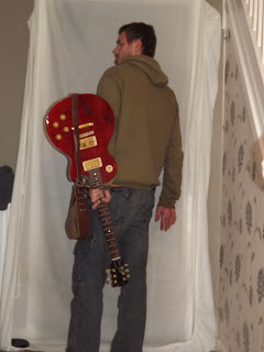
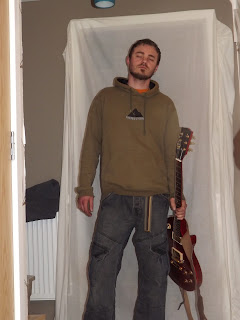
What is he wearing? Anything he finds
comfortable, for the teen rocker it’s not
about fashion it’s about music. Normally
he wears dark jeans and a t-shirt of choice,
most likely of his favourite band or artist.
All of this is topped off with a hoodie that’s
A size too big and a pair of trainers that
should have been binned 3 months ago.
Listening To the latest bands he’s been
introduced to, normally in the form of metal,
rock and punk. Favours bands like Foo Fighters
and Greenday but also enjoys older bands
like Puddle Of Mud or Nirvanna. For him its
all about what catches his interest and discovering
new bands along the way.
Wants to be In a band, music is his sole passion
And theres nothing he enjoys more than making
his own. Often takes up an instrument such as
guitar or drums to pass the spare time between
concerts or tours.
Find him Pushing to get to the front of his
favourite bands concert or discovering new
interests at festivals.
Friday, 27 April 2012
Wednesday, 11 April 2012
contents page remade.
i felt the old contents page didnt have the right feel of a conventional magazine so i went back to the begining of the planning and this time paid more close attention to the structure and layout as well as the style . above are the before and after photos
Tuesday, 10 April 2012
Friday, 6 April 2012
media article
Thursday, 5 April 2012
re development of front cover
while i liked the darkness of the previous front cover in terms of them it rendered some text difficult to read or tell apart from others, as a result ive used more vibrant colours a few shades lighter so that it is easier to view
re edit
i wanted the photo to to be longer widthways so ive had to darken the edges instead of using the crop feature. ive also used a tint effect to fir the style of my magazine
Wednesday, 4 April 2012
latest contents page update
i have been playing around with different word arts as i felt the previous fonts looked quite boring.
Friday, 30 March 2012
Thursday, 22 March 2012
other option
this is another version of the article in a different colour scheme if done this because it fits better with the theme of the magazine however the other one was easier to read
ARTICLE PRODUCTION.
above you can see the two images of my article, one with the picture of an NME article as a guide and the other without.
double page article research.
ive began looking at images on the web of double page articles. i like the layout of image number four so will probably baes my double page layout around this one.
Subscribe to:
Comments (Atom)


